SustainaBags
Logo & Packaging
Designing a logo and visual identity for a sustainable pet waste bag brand — making eco-conscious values instantly readable at a glance.
Client: Sustainabags
Industry: Eco / Pet Care
Scope: Logo + Packaging

THE BRIEF
SustainaBags sells 100% compostable pet waste bags, a product that sits at the intersection of two values increasingly important to modern pet owners: caring for their animals and caring for the environment. The brand needed to communicate both simultaneously, without the logo becoming cluttered or resorting to generic eco-product clichés. It had to work cleanly across packaging, tote bags, and digital channels
PROCESS
Brand discovery
Identified the core brand tension: pet care vs. eco-responsibility. Researched how competitors typically handle this and where they fail.
Concept development
Explored single-mark solutions that could carry both meanings simultaneously — landed on the paw-leaf hybrid as the strongest concept.
Identity system build-out
Developed the full color palette, typography pairing, logo variations, and standalone icon mark for multi-context use.
Packaging application
Extended the identity to a full product box dieline, testing how the system holds up in a real-world retail context.
VISUAL EXPLORATION



KEY DECISIONS
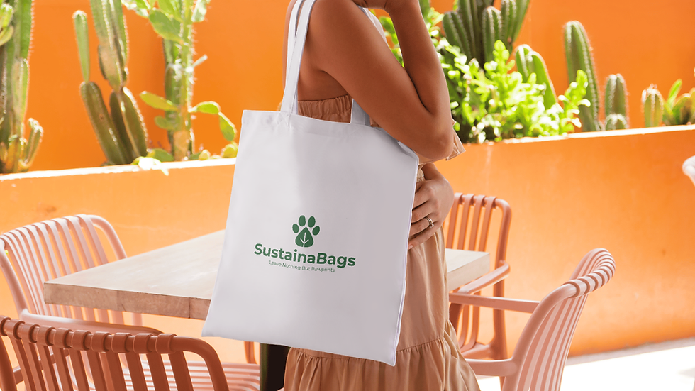
COLLATERAL APPLICATIONS
The paw-leaf hybrid mark
Rather than placing a leaf beside a paw print, the two shapes are fused into one, the leaf's vein structure replaces the paw's central pad. The result communicates both pet care and sustainability in a single, ownable mark that works at any size.
Forest green + earth brown palette
Green anchors the eco positioning. Earth brown references soil and compost, reinforcing the biodegradable product story without stating it outright. Warm beige prevents the brand from feeling sterile and photographs well on the canvas and ceramic products.
Tagline: "Leave nothing but pawprints"
The line echoes the eco-travel principle of leaving no trace, reframes waste into something aspirational, and uses "pawprints" to tie back to the mark, making it feel considered rather than assembled.

OUTCOME
LOGO CONCEPT
Single mark, dual meaning pet care + sustainability
TOUCHPOINTS COVERED
Packaging, tote bag, digital & print
BRAND POSITIONING
Premium eco, trustworthy, natural, modern