Viajero
Brand Idenity, Digital Campaign & SocMed
Building a complete brand identity and social media content system for a custom print-on-demand business, from logo and brand kit to animated reels and Facebook marketing materials.
Client: Viajero Trendy Prints & Designs
Industry: Custom Print / E-commerce
Scope: Brand Identity + Social Media

THE BRIEF
Viajero is a custom print-on-demand business offering personalized designs on tote bags, shirts, and mugs. Targeting customers looking for meaningful gifts, souvenirs, and event giveaways. As a new brand entering a saturated market of generic print shops, they needed a visual identity that felt premium, warm, and trustworthy while remaining approachable for everyday buyers. The scope extended beyond the logo, Viajero needed a complete brand system plus a fully deployed social media presence, ready to publish from launch day.
PROCESS
Brand Discovery & Market Research
Studied the custom print market to identify visual clichés to avoid and positioning gaps Viajero could own — premium warmth in a space dominated by generic, template-driven brands.
Logo Concept & Brand Kit Development
Designed the "V" checkmark mark, developed three logo variations (badge, horizontal, icon), and built the full color palette and three-typeface system.
Product Mockup Creation
Applied the brand to lifestyle mockups across the full product range — tote bags, shirts, and mugs — demonstrating how the identity holds up on physical products
Social Media Content Production
Produced the Facebook cover photo, 5-frame animated story sequence, and promotional video reel — all brand-consistent and ready to publish at launch.
VISUAL EXPLORATION


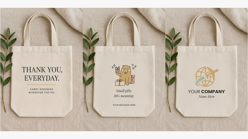

KEY DECISIONS
SOCIAL MEDIA APPLICATIONS
The "V" checkmark, dual meaning in one mark
The stylized "V" reads as the brand initial and a checkmark simultaneously — signaling quality assurance and the satisfaction of a completed custom order. The two-tone charcoal and warm gold treatment gives weight without feeling corporate, keeping it accessible to retail buyers while credible to business clients.
Warm neutral palette, premium without coldness
Off-white, charcoal, nude beige, warm gold, sage green, and blush avoids the saturated primaries common in budget print shops. The palette photographs beautifully on the cream-toned canvas totes and white mugs that make up the product range — making every mockup look lifestyle-ready.
Story sequence as a conversion narrative
Rather than static product photos, the social story was structured as a 5-frame journey: Your design → Ready for something meaningful → From idea to reality → Printed with care → Message us. This mirrors the customer's actual experience, making the content feel personal and conversion-focused rather than purely promotional.


OUTCOME
LOGO VARIATIONS
3 versions — badge, horizontal, icon mark
Social Content
Cover, story sequence & animated reel
Launch-ready
All assets delivered for day-one publishing